8 Inspiring Etsy Product Pin Designs to Market Your Etsy Shop
If you’re an Etsy seller, you know the power of Pinterest to get the word out about your shop. There’s only one problem: Etsy supports a 2:3 landscape listing photo, which isn’t very Pinterest friendly. In this post I’m sharing 8 design template ideas that can be used to promote your Etsy shop listings on Pinterest that utilize the 2:3 ratio, which means you don’t have to export an additional product image just for Pinterest!
Design Guidelines for Etsy Product Pins
When I was creating my Etsy shop pin templates, I did some research on what types of pins are most popular. Something I noticed both on Pinterest and on Tailwind’s community boards is that simplicity reigns supreme. Think about wedding photography for example. Wedding photography is an exceptionally beautiful subject which means that your pins will be living on boards alongside aesthetically pleasing dresses, flowers, venues, food—you name it.
This same mindset can be applied to other industries as well. Simply do a few searches and notice popular themes in the content that’s being shared. Another easy way to do this is by looking at the “recommended pins” pop-up that shows up on Pinterest when creating a new board. Anytime you do this Pinterest is surfacing the most popular pins for that category to get you started.
For this reason, I would recommend a simple design with concise, clean text and maximum focus on the product image you’re featuring.
When it comes to branding, I’d recommend leaving your watermark or logo off the pin for more simplicity. If you have a brand color that’s particularly bold or saturated, I’d recommend toning it down a bit or using a neutral from your brand palette that will look nice alongside all of your products.
1. Large Title with Subtle Details
I love the simplicity of this design because it allows room for the whole Etsy product listing and leads with a prominent text header that can be used to catch the attention of buyers.
2. Product Close Up
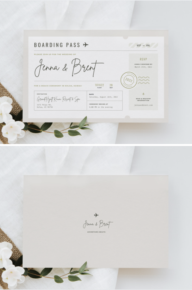
For this one I used the shadow effects on Canva (Edit Image > Shadows > Curved) to create definition in the invitation. This close up view is just a zoomed in and cropped version of my original product photo.
3. White Border & Simple Text
Rather than using dimension, I created a simple white rectangle that I can use to frame whatever product I want to feature.
4. Classic Close Up with Details
This is a pretty popular pin design because it’s so simple and allows the image to shine. For this one I like to use the header text area to feature a benefit or marketing language about the product to really grab a potential buyer’s attention.
5. In Context Close Up
For this design I’m using a phone to showcase a design that would be used on a mobile device, but the sky is the limit. The key word here is in context. If you search on Etsy for products, you’ll likely notice that some of the most popular listings are showing the product in use or in a realistic setting.
Mocking up designs in devices or in real scenes allows the buyer to easily envision that product in their wedding, event, or home.
6. Simple Image Stack
One of my favorite types of Pinterest pins to add to my boards are those without text. The simplicity doesn’t compete with other elements on the board and allows for maximum detail in the product image. This template works especially well to make use of all the additional views of the product that you include on your Etsy listing.
7. Full Size with Corner Note
This design works particularly well for digital download items like invitations, stationery, marketing materials, e-book templates—you name it. I like to use the “note” area to highlight keywords someone might be searching for.
8. Icon & CTA
You’ll recognize that this is a similar design to some of the others I shared but I’ve added a call to action area and icon for variety and visual interest. This is a good strategy to keep in mind when creating templates for yourself: creating variety in your Pinterest feed doesn’t mean having to reinvent the wheel every time!


