Canva Made Easy: How to Effortlessly Create Beautiful Workbooks for Your Business
Looking to create stunning and professional workbooks for your business without the hassle? Look no further than Canva! In this article, we will show you how to effortlessly use Canva to design beautiful workbooks that will captivate your audience.
Canva is known for its user-friendly interface and vast library of customizable templates. With Canva, you don't need to be a design expert to create eye-catching workbooks that showcase your brand and expertise. Whether you're a solopreneur, coach, or educator, Canva offers the tools and resources you need to make your workbooks stand out.
In this step-by-step guide, I'll walk you through the process of using Canva to create visually appealing workbooks that engage your audience and deliver value. From choosing the right template to customizing fonts, colors, and images, we've got you covered. Plus, we'll share tips and tricks to enhance your workbook's overall appeal and professionalism.
Don't let design woes hold you back from sharing your knowledge and expertise. With Canva, creating beautiful workbooks for your business has never been easier! Join us as we unlock the secrets to effortless workbook design with Canva.
Step 1) Choosing the right template for your workbook
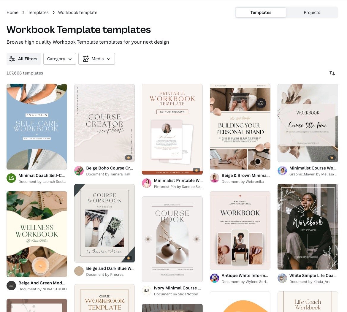
The first step in creating a workbook with Canva is choosing the right template. Canva offers a variety of pre-designed templates specifically for workbooks. To find these templates, simply search for "workbook" in the Canva search bar.
Once you've selected a template that suits your needs, you can begin customizing it to reflect your brand and content. Canva allows you to change the colors, fonts, and images within the template, making it easy to create a workbook that matches your unique style.
Try to pay attention to the design elements used in each template. For example, if you have delicate, feminine, branding, a template with heavy design elements is going to take a lot of elbow grease to fit into your brand’s world. The goal is to make this step as easy as possible to achieve.
Step 2) Customizing your workbook with fonts, colors, and images
Customizing the fonts, colors, and images in your workbook is crucial for creating a cohesive and visually appealing design. Canva offers a wide selection of fonts and colors to choose from, ensuring that you can find the perfect combination to represent your brand.
When selecting fonts, it's important to choose ones that are easy to read and complement your content. Canva provides a preview of how each font will look in your workbook, making it easy to compare and choose the best option.
Similarly, choosing the right colors is essential for creating an aesthetically pleasing workbook. Canva allows you to select colors from their pre-set palettes or create your own custom color scheme. Make sure the colors you choose have enough contrast with the background you’re using. No white fonts on beige backgrounds, please! Additionally, make sure the fonts you choose are legible and easy to read, just in case someone might be consuming your content on the small screen of a mobile device.
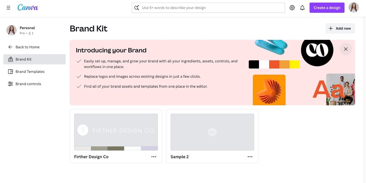
Tip: This step is so much easier if you’ve already added your brand’s colors, fonts, and logos into Canva Brand Kit. You can find the link to this of this on the Canva home page. It’s super easy!
Lastly, adding images to your workbook can enhance its visual appeal and make it more engaging for your audience. Canva provides access to millions of high-quality stock images, or you can upload your own images to personalize your workbook even further.
Step 3) Make sure your workbook content is easy to consume
There’s a reason why people prefer cookbooks with photos: they’re more engaging an interesting than a text heavy option! Keep this in mind when it comes to designing your workbook content. Your goal as the designer is to effortlessly guide the viewer through the content.
Here are some tips and tricks to help you create stunning workbooks with Canva:
1. Keep it simple: Avoid cluttering your workbook with too many elements. Stick to a clean and minimalist design that allows your content to shine.
2. Use high-quality images: When selecting images for your workbook, choose ones that are high-resolution and relevant to your content. This will make your workbook look more professional and visually appealing.
3. Use consistent branding: Ensure that your workbook aligns with your brand identity by using consistent fonts, colors, and imagery throughout. This will create a cohesive and polished look.
4. Break up text with visuals: Incorporate visuals such as icons, graphs, and charts to break up text-heavy sections. This will make your workbook more visually appealing and easier to digest.
5. Pay attention to spacing and alignment: Proper spacing and alignment can make a significant difference in the overall appearance of your workbook. Make sure that text, images, and other elements are properly aligned and spaced for a polished look.
Step 4) Adding interactive elements to your workbook
Taking your workbook to the next level involves adding interactive elements that make it more engaging and interactive for your audience. Canva offers a range of interactive features, such as clickable buttons, checkboxes, and text fields.
By incorporating interactive elements, you can create activities, quizzes, and worksheets that your audience can interact with directly in the digital version of your workbook. This not only adds value to your content but also encourages active participation from your audience.
Something I do in every single workbook or download is to include a last page with a prominent call to action. What is your audience’s next step?
It could be:
Visiting your website
Signing up for your email list
Getting access to a discount
Shopping your products
Listening to a podcast episode
Following along on social media
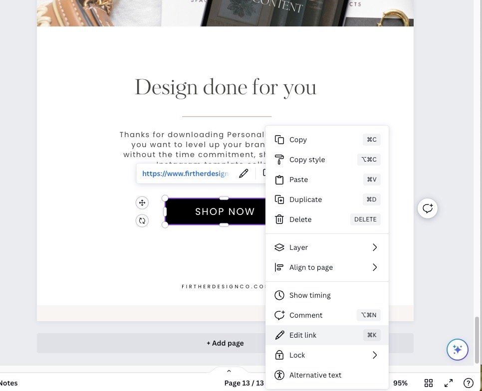
Once you decide on your CTA, you can add a button to the page and add a link by right-clicking the button and choosing “link.” Always be sure to test it to make sure everything works correctly!
Step 5) Proofread and share your workbook
Once you've finished designing your workbook in Canva, it's time to share and distribute it to your audience. Be sure to do a pass at the grammar and overall flow of your workbook to ensure it comes across as high quality as possible.
When it comes to sharing, Canva offers various options for sharing your workbook, including downloading it as a PDF, sharing a link, or embedding it on your website. If it’s a free workbook, I prefer to download as a PDF and attach to a form in Flodesk (my email provider).
If you plan to distribute physical copies of your workbook, you can also use Canva's print services to have them professionally printed and delivered to your doorstep.
Conclusion
Congratulations! You've unlocked the secrets to effortless workbook design with Canva. Now, go forth and unleash the power of knowledge with stunning, impactful workbooks that captivate your audience and elevate your brand. Remember, with Canva as your design partner, the possibilities are endless:
Elevate your expertise: Showcase your knowledge and insights in a visually compelling format that commands attention.
Boost engagement: Use interactive elements and captivating visuals to keep your audience actively participating in your content.
Strengthen your brand: Design cohesive workbooks that resonate with your brand identity and establish you as a thought leader.
Effortlessly distribute: Share your workbooks digitally or print professional copies – the choice is yours!
So, what are you waiting for? Dive into Canva today and discover the joy of crafting beautiful, powerful workbooks that make your knowledge truly shine. With a little creativity and the guidance in this article, you'll be amazed at what you can achieve. Happy designing!
Bonus tip: Don't hesitate to experiment and explore! Canva offers a vast library of templates, features, and resources to suit any niche or creative vision. The more you play, the more you'll discover the limitless potential of workbook design.


