5 Ways to Improve Etsy Digital Download Listings
Creating a high-quality listing is super important to converting viewers into buyers on Etsy. There are basic things like writing a clear description, adding photos, and a good title, but there’s also a lot of opportunity beyond that to convey trust and quality to the buyer. In this post, I’m going to walk through five easy ways to improve your digital download listings. You can apply these concepts to other products as well, but many of my recommendations are specifically for digital formats.
Include clear and concise instructions in the listing images
You might ask: if I have a text description, why would I include instructions in the image section? Two words: attention span. When a customer is shopping Etsy, it’s pretty likely they’re swiping through on a mobile device. The goal is to catch them while they’re swiping through the image carousel and help them decide if it’s what they’re looking for.
If you think about what fits in a phone screen without scrolling, the text description likely isn’t visible so you want to grab their attention before they hop to the next listing.
Include a specs section with size, format, and color options
This section is all about clarifying expectations. When selling a digital product, it’s really important to educate the buyer that they won’t be receiving a physical item. The high-quality mockups many sellers use can make it hard to tell, even though Etsy does put a “digital download” label on the product listing.
I always include the dimension for home printing, file format, and “Not a Physical Product.” I also like to include the color swatch on the bottom with on brand swatch names to make it feel extra special.
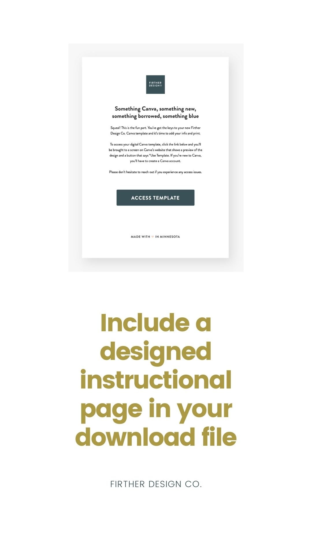
Include a designed instructional page in your download file
I wouldn’t call myself a copywriter but I definitely moonlight as one. If someone is buying a digital product from you at the end of the day that’s a tiny (yet very valuable!) little link in their inbox. I like to amp up the excitement as much as possible for my template downloads. I include a thank-you, information about their purchase, and instructions on what to do if there’s an issue. For inspiration on what to write, check out this site for branded order email inspiration.
Rather than just sending a link, I have a branded page with a large button on it. Then, in Acrobat I add a link to the template and highlight the whole button as a clickable area.
Name your file something clear and on brand
I feel like Jack Donaghy on 30 Rock writing this, but seize every opportunity to create an on brand experience. Even something as small as a file name sets the tone for the buyer experience.
I like to name my products something upbeat and playful, so I make that the file name, which looks much better than something like “FinalDesign.PDF.” I also recommend using title case for capitalization.
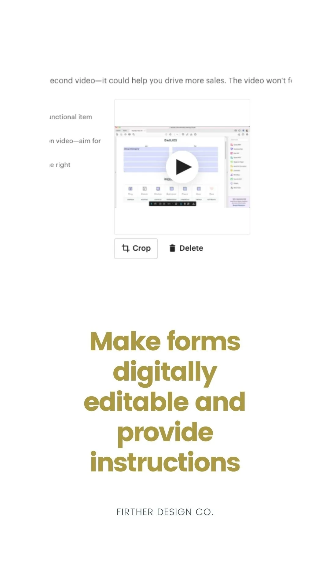
Make forms digitally editable and provide instructions
I read a piece of advice that said to always under-promise and over-deliver. Which…seems pretty obvious and I definitely should’ve known that myself. But alas, here we are learning something every day!
In that spirit, I always try to squeeze every last bit of value and delight into everything I make. An easy way to add an extra layer of usefulness to a digital product is to make the form fields digitally editable in Adobe Acrobat.
This allows the buyer to use the product in various ways (especially since home printers don’t seem to be as common these days). If you need instructions on how to create editable forms, check out my article here. If you’re like me and thought, “that seems like too much work,” fear not! Acrobat is super smart and able to auto-detect your form fields with the click of a single button. Amazing! And a total no-brainer.
Include usage guidelines and tips inside the download file
It’s common to write how to use the product in the text description of the listing, but think beyond the Etsy universe for a minute and put yourself into the buyer’s shoes. If they intend on making this product a part of their everyday life, make it simple for them.
Rather than making them come back to Etsy to reference instructional info, include it along with the file for a super clear and helpful experience. For example, for a cleaning checklist printable I have in my shop I include a set of suggestions on what to fill each section. Anything you can do to ensure their experience with a product is a success will help increase the odds that they’ll be a repeat customer.


