How to Create a Blog On Squarespace
In this post, I’m sharing everything you need to know about setting up a blog on Squarespace. Blogging is an important aspect of growing your brand and content marketing so this will help set the foundation for your website.
This guide is for anyone who is new to Squarespace or has a Squarespace site and is interested in adding a blog feature to their website. I’ll cover setting up the blog page in a Pinterest-friendly manner and how to prepare blog posts.
How to set up a blog page in Squarespace
The blog page is the home to all your published articles and is an important link to include in your navigation. A word of caution: stick to something well known when naming this section. I’ve seen people use branded phrases like “Journal” for the blog section, but this isn’t the best for user experience, as it may be unfamiliar to a user.
Setting Up the Blog Page
If you’re starting with a template, it will likely already have a blog page added. If not, you can click the “+” sign under Home > Main Navigation to add it. I would recommend choosing a page template from the list that allows for users to easily scan for articles. My website is using the “Blog 2” template as of November 2021. If you don’t, fear not as the layout can be easily swapped in the Edit module for the section.
To customize how the posts show up, click Edit on the blog page and then click Edit for the section on the page that contains the post grid. Here you’ll be able to customize the look and feel of the page by adjusting the columns, spacing, and design. If you scroll to the bottom of the Format tab, you’ll see an option for changing the image ratio under "Image Placement.” I recommend changing this to 2:3 so your Pinterest-ready post images don’t get cut off. The less image sizes, the better, right?
The last thing to check here is to ensure that you have the “Read More” link enabled. An image isn’t often enough of an indicator to a user that something is clickable.
Writing a blog post in Squarespace
Now that you have your blog page set up, you can move into writing and publishing blog posts. One of the things I love about Squarespace is how intuitive and well-designed it is. Clicking the “+” arrow gives you a slew of options that will allow you to post things uniquely tailored to you. Definitely click around and familiarize yourself with the options in this section.
Writing the Post
I like to write my posts in Squarespace because I feel like it’s a smoother process. Previously I would write in Google docs and bring it over, but always felt like I spent too much time fixing extra spaces and wonky formatting. For SEO purposes, remember to use H2 headings when adding sections to your Squarespace blog articles.
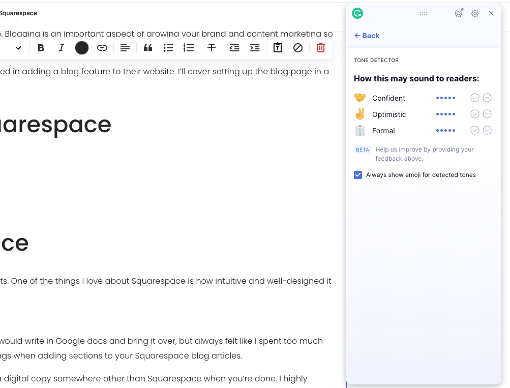
That said, this isn’t a cloud-based way of writing so be sure to save periodically and archive a digital copy somewhere other than Squarespace when you’re done. I highly recommend downloading the Grammarly browser extension to correct grammar and get a pulse on how your article sounds. It shows up in the bottom corner of a text box in Squarespace when enabled (also works in Google Docs and other programs) and is immensely helpful.
Example of the Grammarly tone detector in this article
Adding Images and Media
Images are an important aspect of blogging because it helps break up the page and provide helpful context to the reader. I like to include an article title image, supporting example images, and step-by-step diagrams when applicable.
However, since many Squarespace sites don’t have a sidebar I find that uploading a full-width image takes up too much of the screen on desktop. Instead, I prefer to use the Card styling on the Design tab when uploading a post image (image example below). It allows me to upload a 2:3 ratio that’s suitable for Pinterest, doesn’t take up the full screen, and is still full width on mobile. The only thing you need to do is remove the example text Squarespace adds.
I only use that option when I’m uploading Pinterest images. When I’m adding example images like the one below, I use full width for maximum detail.
Posting and Optimizing Your Post
Once you’re done writing a post, you can either Publish or Schedule it. You’ll see this option in the top left-hand side of the page when saving a blog post. I prefer to schedule my posts (gotta give the illusion that I’m not burning the midnight oil, right?!). It also helps me establish a regular cadence for my posts so my readers know what to expect.
The last thing to do before the article goes live is to take a pass at the SEO (Search Engine Optimization) of the post and add a cover photo. This can be done by hovering over the blog post name on the left of the page and choosing Settings from the list that appears. Under the Blog Post Settings title you’ll see an option for Content. This is where you’ll add your blog post title image so it shows up in the carousels and blog post pages on your site.
Next, navigate to the SEO section. Here you can add the SEO title and description. For more information on SEO, this Yoast article is a great resource. Lastly, choose Options from the same menu you found SEO and add your categories and tags.
Whew, that wasn’t so bad right? I once heard that the key to blogging is to be consistent and keep the long game in mind. Now you have an easy to use foundation set up and have learned everything you need to know about writing a post! Whatever topic you’re writing about, I’m rooting for you.


