How to Create a Useful Brand Identity Board in Canva
So, you’ve been spending some time creating a new brand identity, but now you want to share it with your team to make sure everyone is on the same page.
Creating a memorable brand experience is one of the best investments you can make in your business. In fact, just using a signature color can increase brand recognition by 80% (Reboot, 2018).
The good news? It’s super easy to create a brand identity board in Canva that your whole team can start using today.
Sound good? Let’s take a look at what you should include on your brand board.
What needs to be on my brand identity board?
Think of your brand identity board as a toolbox for anything that needs to be designed for your brand. You want to include all the little pieces that should be consistent throughout your brand visuals. At a minimum it should include:
Logo and variations
Color palette
Typography
Brand imagery
Let’s walk through each of these sections for a clearer description of what you should include.
Logo and variations
Include all variations of your brand logo. This includes your primary logo and any other variations that are approved for use for your brand. I recommend including variations that work for a social media profile and an option that can be used in both light and dark environments.
Brand Color Palette
Ah, the brand color palette. So many beautiful colors, so hard to decide! For brand colors I recommend a straightforward checklist:
1 primary color
1 secondary color
1 light accent
1 dark accent
1 neutral
You can also check out my Personality to Palette workbook download for a whole page of color palette inspiration to get you started.
Brand Typography
If this is your first brand kit, I recommend choosing no more than two typefaces. Successful typography is all about creating visual contrast, which is why a serif and sans serif pairing is so popular.
There are two things you need to keep in mind when selecting your brand typefaces: personality and legibility. These two things go hand in hand in any successful brand kit.
You can inject a lot of personality into the headings style, but be sure that you don’t get too crazy with the body text because you want to ensure it’s readable. I’ve heard people say, “a good body font is boring” and I totally agree with that. Avoid using chunky styles, high contrast serifs, script, or all caps for body text.
If you need some inspiration, I have a ton of Canva font round ups including this list of 24 of the best Canva font pairings.
If you find a brand font you love in Canva, be sure to check that it’s available in whichever web platform you use for your business.
Brand Photography
The brand photography section is super impactful because it’s one of the fastest ways to communicate the mood of your brand. I scour Pinterest (or the Canva photo library) for a variety of inspiration photos. I recommend including a variety here:
Photos that show examples of texture
Photos with similar lighting and shadow
Photos that include a person
Photos with scenery and objects that embody your brand
Create a Brand Board in Canva
This is the easy (and fun) part. Once you have all the assets to include in your brand identity kit, it’s time to head over to Canva. I’ve created a free Canva template for a brand identity board that you can get a copy of here.
This template includes all of the sections we walked through above and an area to include a few brand adjectives to really set the tone. You can modify the template however you’d like to work for your business!
How do I access the brand visual template in Canva?
If you’re new to Canva, you’ll have to create an account. Signing up is easy and the best part is that Canva is free to use! If you already have a Canva account, the template link will take you right there. There’s no software download required, which means you can easily share the final product with your team.
Once you open your template, be sure to rename it to something easily searchable. From there it’s just a simple exercise of dragging your brand assets into the correct spot and filling out the remaining section.
When the brand identity template is completely filled out, you can export and share as needed.
How to share your brand kit in Canva
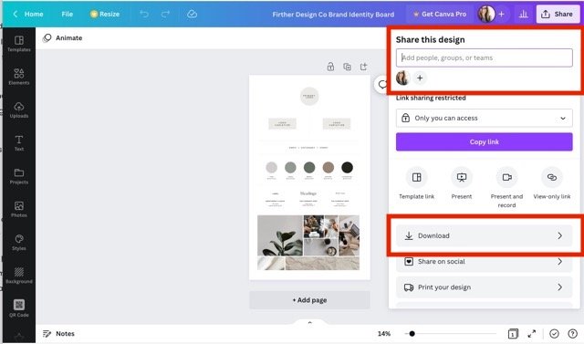
To save your brand kit, click the Share button in the top left of the screen then choose Download from the options. You’ll be able to download your brand visuals kit as a .JPG, .PNG, or PDF.
To share your brand kit with your team click the “+” (plus button) next to your profile photo in the top right of the Canva workspace. Next, click the slashed eye icon besides the team name. If you don’t have a team in Canva, you can also invite them by email. For more documentation on this check out this article on Canva’s help site.
Conclusion: How to Create a Useful Brand Identity Board in Canva
Creating a brand identity board puts you one step closer to a more cohesive brand. You can use it as a compass to guide your brand to consistency across platforms and easily share with your team.
It’s not likely you’ll be changing it all too often, but if you do, I recommend creating duplicate copies of the artboard to keep track of the evolution over time. You can also continue to add to it by expanding it to add more detail. You can include examples of different color combinations together, different text configurations, or include icons.
To expand beyond the visuals of your brand you can add a page on brand tone and copy to help your team create copy, publish social media content, and write emails.
If you have a brand identity board, what do you include to help your team thrive?


